

hiku
Strategic research and interaction design to improve retention for a connected kitchen device
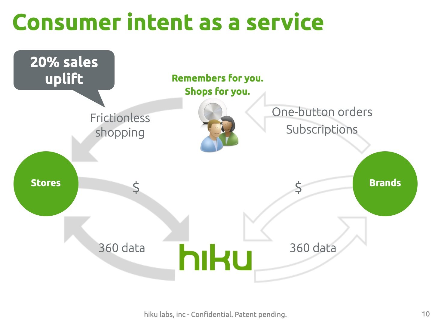
hiku was a connected device and mobile app designed to help busy families stay on top of grocery shopping. Living in the kitchen, hiku scanned barcodes and recognized voice input to create a shared grocery list on a user’s phone. With one-button simplicity, it was designed so everyone in the household could participate in keeping the list up to date.
I worked on hiku from early product development through launch and post-launch optimization. The product developed a small but highly enthusiastic user base, and user research conducted in people’s kitchens consistently showed strong emotional attachment. Our strategy was to get distribution support from our retail partners who connected hiku to their e-commerce platforms. We ran several e-commerce pilots — with Peapod, Walmart, HEB, and a French retailer, Chronodrive. These partnerships were challenging to develop, and we ultimately struggled to establish a sustainable distribution channel.
Understanding Churn and Retention
At launch, 39% of hiku users were still active after six months—a strong result for a new product category. Because the business model depended on long-term engagement to deliver meaningful household consumption data to retailers, improving retention became a primary focus.
I partnered with engineering to implement Mixpanel, giving us better visibility into user behavior and drop-off points across the customer journey. This analysis highlighted two primary areas for deeper investigation:
Onboarding and education
Many users never connected the device to Wi-Fi, or used only scanning or voice, rather than both.Habit formation and maintenance
Some users successfully formed a habit around hiku, but usage dropped off over time.
Fixing Onboarding
I observed users struggling with nearly every step of device setup. Some didn’t realize they needed to download the app before the device would function; others were blocked by unclear instructions, forgotten Wi-Fi passwords, or ambiguous calls to action.
I documented these breakdowns and worked closely with the CEO and engineering team to address them. Improvements included:
a redesigned Quick Start guide with a clear “download the app” call to action
a reimagined in-app onboarding flow
embedded video demonstrations showing how to scan and speak with hiku
These changes significantly reduced early-stage confusion and drop-off.
Encouraging Habit Formation
Through observational research, I identified several reasons why users who successfully onboarded eventually stopped using hiku. One surprisingly common issue was simple but fatal: the device ran out of battery and was never recharged.
To address this—and other points of friction—we made a series of targeted improvements. We added clear battery-level indicators and proactive low-battery notifications in the app. We also optimized the Add Items flow to make it easier to add items directly in the app, and redesigned the Quantity Picker to support quick increments while still accommodating voice-entered quantities.
Impact
hiku was a popular holiday gift, making post-holiday retention a critical metric. Over two years of incremental improvements to the user experience, informed by research and analytics, six-month retention increased from 39% to 62%.
Talk to hiku…
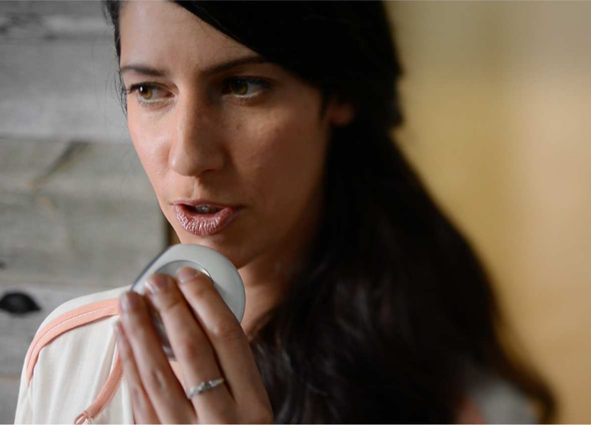
Or scan barcodes with hiku

To put things in your grocery list
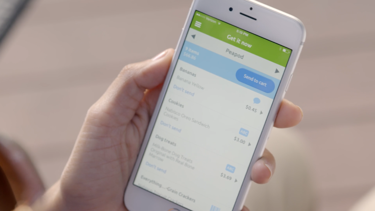
Sample interaction design

Fundraising and partnership storytelling