Counterpace
From a technical prototype to a usable, engaging wearable product experience
Counterpace provides audible and visual guidance that helps athletes synchronize their step rate with their heart rate to improve cardiovascular performance. By teaching users to step between heartbeats, the system helps the leg muscles act as a secondary circulatory pump, supporting the heart and improving blood flow.
Counterpulsation is inspired by external counterpulsation, an established clinical therapy that uses inflatable boots to achieve a similar effect. Counterpace translates this principle into a natural, wearable form of counterpulsation.
I worked closely with founder Jeff Bleich and his engineering team to turn an early technical proof of concept into an approachable, understandable, and straightforward user experience.
Application Design
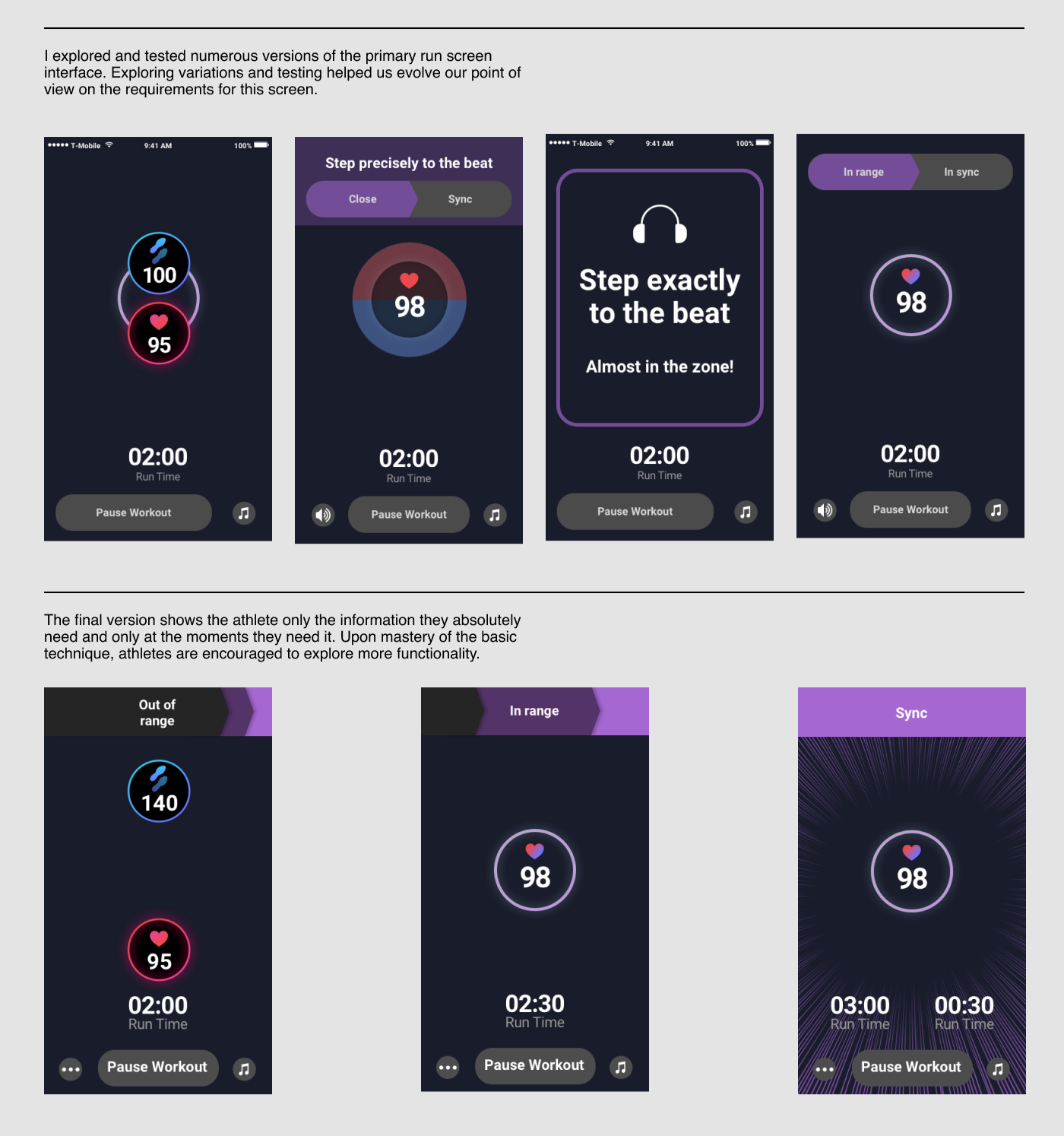
I began by auditing the existing engineering prototype and testing it with users on the treadmill to understand how the experience performed under real physical and cognitive load. While the underlying technology was sound, the interface made it difficult for users to quickly grasp what the system was asking them to do and why it mattered.
I led a series of collaborative design sessions and tested multiple iterations to arrive at a simple, easy-to-follow interaction model. The redesigned interface made more efficient use of limited screen real estate, clarifying the core experience while still making advanced features available without obscuring the fundamentals of use.
Onboarding Experience
I observed the founder personally introducing Counterpace to new users during treadmill sessions, paying close attention to the language, metaphors, and pacing he used to explain the system. These observations informed a redesigned onboarding flow that translated his one-on-one guidance into a scalable approach.
The result was a combination of an in-app orientation video and a printed guide that helped users quickly understand the system and feel confident using it independently.
Logo and Logotype
I inherited an early draft of the Counterpace logo and led a short design sprint to refine and clarify it. The final identity captures the sense of rhythm and flow central to the product, with a symbol and wordmark that work together or independently while maintaining clarity and distinctiveness.


